Call for Entries!
Smog City’s 1st Anniversary is approaching and approaching rapidly. We are designing a special logo to celebrate and if you’re an artist, we may be looking for your help.
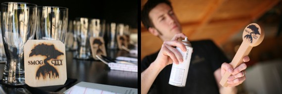
Here’s the background. Porter and I have been avid art collectors for many years. When Smog City came into being we focused on The Craft. Craft beer, word craft for our beer names and wood craft for our tap handles, hand branded coasters and, of course, our logo. Our dearest logo, this was the image we hoped to brand into the memories of those dedicated to supporting and pushing forward the craft beer industry. We wanted it to be art.

Smog City knew when we started out that the logo was key. It had to be memorable and speak for and about our brand. Many people have asked us where it came from and now here’s the answer.
As I said, Smog City is about craft. So when we started conceptualizing the logo it was always with an artist’s hand in mind. Our earliest logos looked more like a classical etching which spoke to our traditional leanings, create solid base beers and then modernize them. Bring them into the fold of new craft beer, innovative and creative but still balanced.
Our friends at Ignition Print helped create the Smog City logo. They used one of their freelance artists to work specifically on the logo. We were excited to find out that our logo was to be drawn by artist, Su Jen Buchheim. She’s crafted children’s books (which Emmett loves!), movie posters and her own personal art work. When Laurie heard that Su Jen was working with us, she was especially excited as she had known about her work for years. Best of all, Su Jen nailed our concept almost immediately.
As concepts came in we lived with the print-outs on our kitchen wall and when one fell out of our favor, it was folded up but not taken down. The earliest drawings were of an old oak tree drawn in a classical style, which evolved into a wood cut style and then modernized into the silhouette we all know and love.

One of the original oak tree sketches.
Originally we loved the idea of an old oak or elm tree, which we felt spoke of knowledge and tradition but as the logo progressed we realized we needed to localize the tree. We chose the California coastal cyprus as it is known for its longevity and has long been a recognized symbol of California. What also made the tree more personal is that it is Laurie’s favorite tree in the world. (Next to the monkey pod trees of Hawaii!) In our logo, the roots of this beautiful tree come down to form the Los Angeles skyline, where both Porter and I have placed our own roots and where Smog City was born.
The more we looked at the logos the more we leaned towards a clean, sharp line. The ones that read easily from our couch kept jumping out at us. We imagined sitting at the bar and looking at tap handles, we wanted to be able to read the Smog City logo even when we couldn’t see the name.

Here’s one of her first passes at the coastal cyprus tree version.
So now, here we are, one year later and looking for a piece of art for our 1st anniversary. Once again we have the concept but not the art. So this is what we are doing. We’re putting out an all call for entries. Entries are to be sent to Laurie at laurie@SmogCitybrewing.com and a favorite will be selected on August 20th 2012. Feel free to send jpgs, computer renderings or snap shots of the original artwork. Anything to show us what you’re working on.
This is one idea that we’d like to see explored but we’re open to all ideas.
The artwork:
A prehistoric sabre toothed squirrel skull with one lit candle on top of its head. The wax dripping down from the candle over the skull forms the city skyline like we have it in our logo. All entries must be one or two color max.
Attached is a skull jpg in the style we’re thinking…although if someone comes up with a better idea, we’ll happily switch directions. And the second is an artist rendering of a saber-toothed squirrel for reference in creating a skull.

Run with it and have fun. If you want to draw up a sketch and send it for review or comments, please do! Also and best of all, besides bragging rights and a free T-shirt the selected favorite will receive $100. We are anxious to see your artwork, so get working!!!


